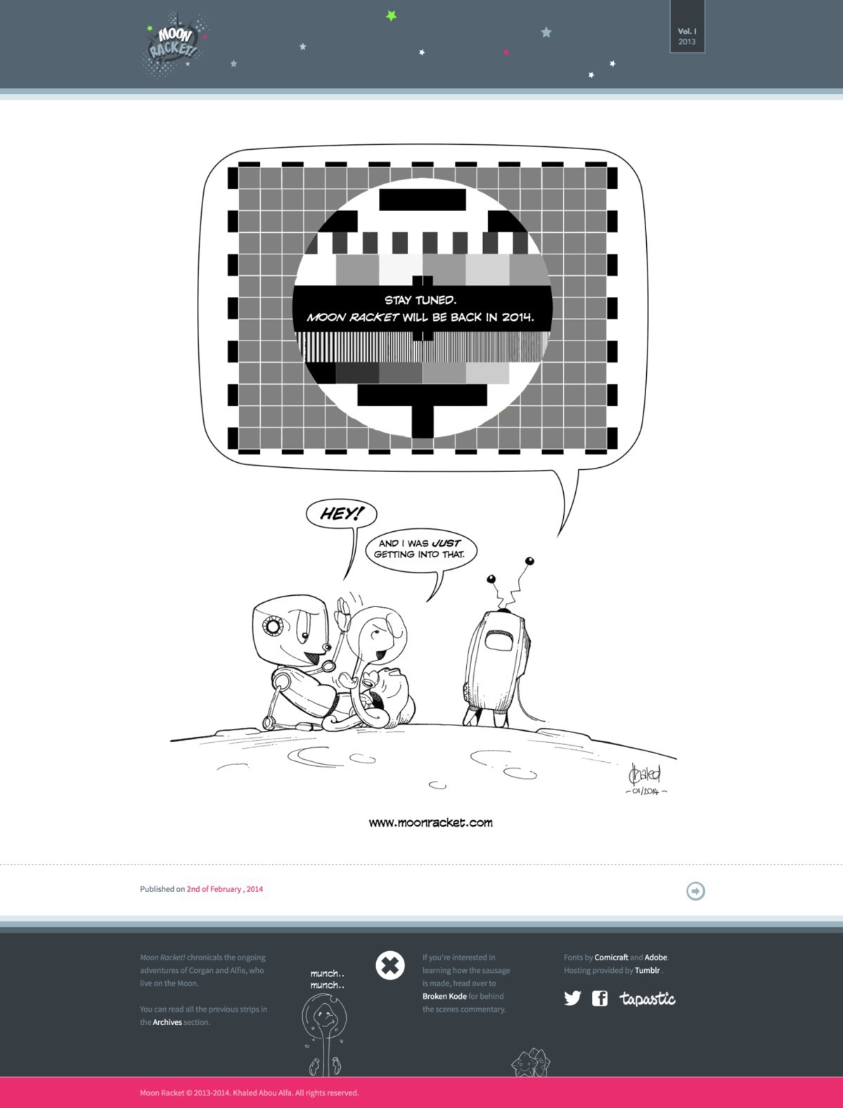
Website Relaunch
When I released Moon Racket! I was never happy with the website, as I felt it wasn’t a particularly good showcase of the work. While the general presentation of the same exact strips on both Facebook and Tapastic was marginally better, I’ve wanted to make sure that I addressed this issue before starting to release Season Two.
After many months of the final mockup gathering dust in the project folder, I was able to buckle down over the weekend and put the site together.
The main aim for this design was to make sure that the focus of the site was on the strips themselves. This explains the gradual grade from the top and bottom bars to white and focusing on the strip. Not everything is perfect (It’s not a fully responsive site or at least not in a meaningful way), however improvements will be ongoing now that the base is established.
In addition to the new window dressing, you can finally read all the Moon Racket! strips in high definition - I re-uploaded high resolution versions of all the images to look good on a retina display.
